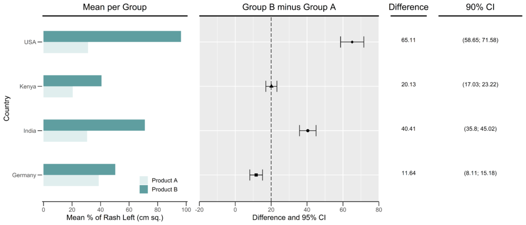

High Quality Forest Plots in R GGPLOT2
A forest plot is a very efficient way to present the results of an analysis that compares two groups for several populations or subgroups. It shows all the important information together in a single figure.
Forest plots usually consist of multiple plots and tables. In this post, we will create each individual figure and table separately with the ggplot2 package. Then we will merge all the individual plots and tables together using the grid.arrange() function in the gridExtra package.
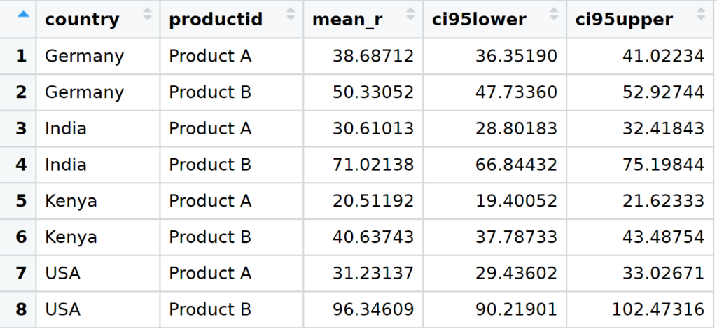
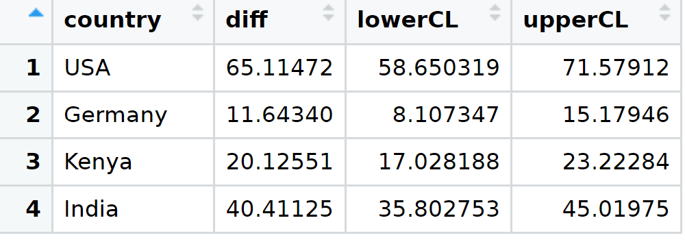
The structure of the datasets used to create the tables and figures in this post is as follows:
Generate the Separate Panels of the Forest Plot
Plot 1
p1 <-ggplot(data=statsrash, aes(x=factor(country), y=mean_r, fill=factor(productid))) +
#Creates a bar graph
        geom_bar(stat="identity", width=0.5, position=position_dodge()) +
#Flips the axes to create horizontal bars
        coord_flip() +
        ggtitle("Mean per Group") +
#Creates a horizontal line on top of the graph
        geom_vline(xintercept=4.6, size=2) +
        labs(y = "Mean % of Rash Left (cm sq.)", x = "Country", fill = "Group") +
        scale_y_continuous(breaks=seq(0,100,20), limits=c(-1,101), expand=c(0,0) ) +
        scale_fill_manual(values=c("#E0EEEE", "#5F9EA0")) +
        theme_classic(base_size=14) +
        theme(
          #Colors the y-axis line white to make it invisible and setting the length of ticks
          axis.ticks.length=unit(0.3,"cm"),
          axis.line.y = element_line(colour = "white"),
          axis.line.x = element_line(size = 0.6),
          #Use this to control the legend position
          plot.title = element_text(hjust =0.5),
          legend.position=c(0.8, 0.1),
          legend.title=element_blank()
        )

p1
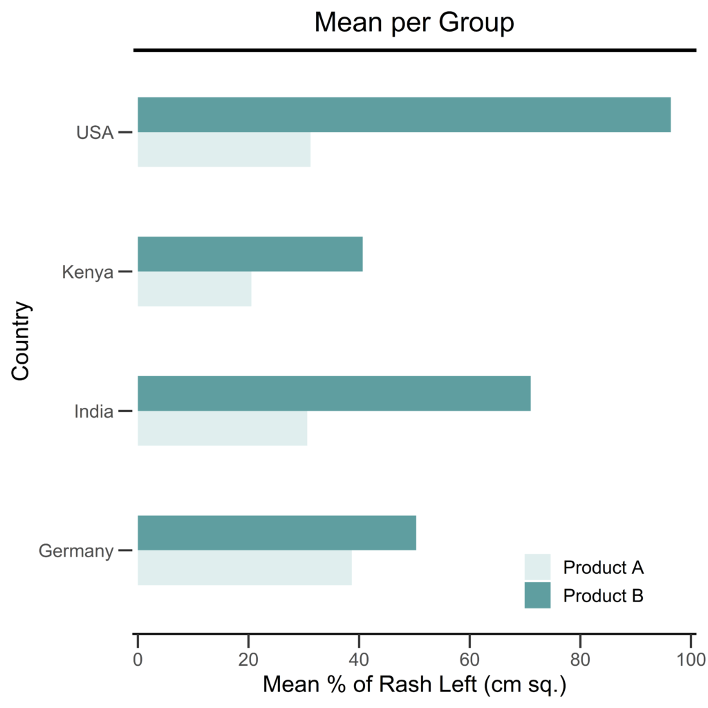
Removing the y-axis line may not be necessary in your case. I personally like the look of the bars without the y-axis line.
Depending on how data appear on your graph, you may need to adjust the position of the legend, such that it is clearly visible and does not cover a section of the plot.
Plot 2
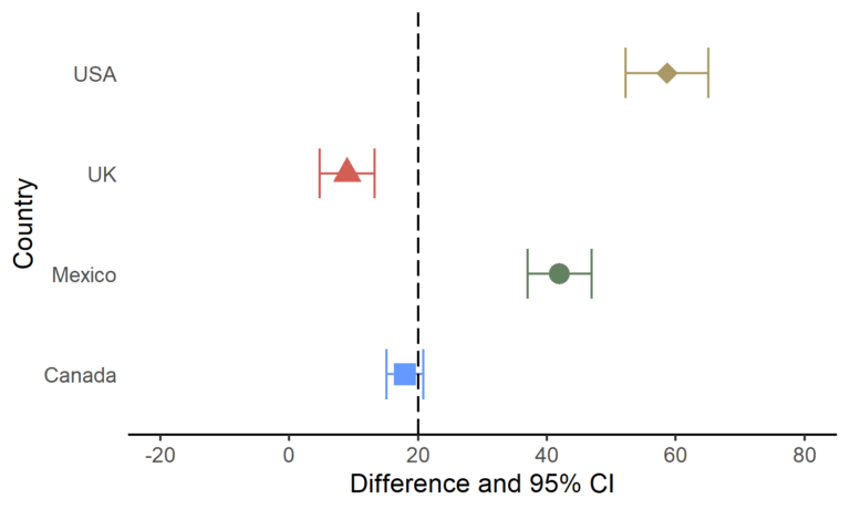
p2 <- ggplot(diffci_3, aes(x=diff, y=country, shape=country), color="black") +
#Add dot plot and error bars
        geom_errorbar(aes(xmin = lowerCL, xmax = upperCL), width = 0.25) +
        geom_point(size = 2.5) +
        ggtitle("Group B minus Group A") +
#Add a line above graph
        geom_hline(yintercept=4.6, size=2) +
#Add a reference dashed line at 20
        geom_vline(xintercept = 20, linetype = "longdash") +
        labs(x="Difference and 95% CI", y = "Country") +
        scale_x_continuous(breaks=seq(-20,80,20), limits=c(-20,80), expand=c(0,0) ) +
        scale_shape_manual(values=c(15,16,17,18)) +
        theme_gray(base_size=14) +
#Remove legend
#Also remove y-axis line and ticks
        theme(legend.position = "none",
              plot.title = element_text(hjust =0.5),
              axis.line.x = element_line(size = 0.6),
              axis.ticks.length=unit(0.3,"cm"),
              axis.text.y  = element_blank(),
              axis.line.y = element_blank(),
              axis.ticks.y = element_blank(),
              axis.title.y  = element_blank()
              )

p2
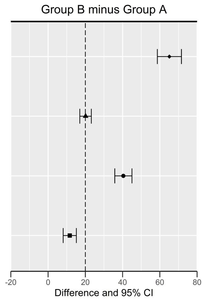
Plot 1 and Plot 2 will be placed side-by-side. Therefore, if a y-axis range is specified in Plot 1, the same range should be used in Plot 2, to have both plots align properly in the final forest plot below.
Table 1
t1 <- ggplot(data=diffci_3) +
  geom_text(aes(y=country, x=1, label= paste0(round(diff, digits=2))), vjust=0) +
  #Add a line above graph
  geom_hline(yintercept=4.6, size=2) +
  ggtitle("Difference") +
  xlab("  ") +
  theme_classic(base_size=14) +
  theme(
    axis.line.y = element_blank(),
    axis.line.x = element_line(color = "white"),
    axis.text.y  = element_blank(),
    axis.ticks.y  = element_blank(),
    axis.ticks.x = element_line(color = "white"),
    axis.ticks.length=unit(0.3,"cm"),
    axis.title.y  = element_blank(),
    axis.text.x = element_text(color="white"),
    plot.title = element_text(hjust =0.5)
  )

t1
The x-axis is not necessary here, hence it is removed (colored white). Even though the y-axis is not shown here, it should align with the above plots in the final plot.
Table 2
t2 <- ggplot(data=diffci_3) +
  geom_text(aes(y=country, x=1, label= paste0("(",round(lowerCL, digits=2),"; ", round(upperCL, digits=2),")")), vjust=0) +
#Add a line above graph
  geom_hline(yintercept=4.6, size=2) +
  ggtitle("90% CI") +
  xlab("  ") +
  theme_classic(base_size=14) +
  theme(
    axis.line.y = element_blank(),
    axis.line.x = element_line(color = "white"),
    axis.text.y  = element_blank(),
    axis.ticks.y  = element_blank(),
    axis.ticks.x = element_line(color = "white"),
    axis.ticks.length=unit(0.3,"cm"),
    axis.title.y  = element_blank(),
    axis.text.x = element_text(color="white"),
    plot.title = element_text(hjust =0.5)
  )

t2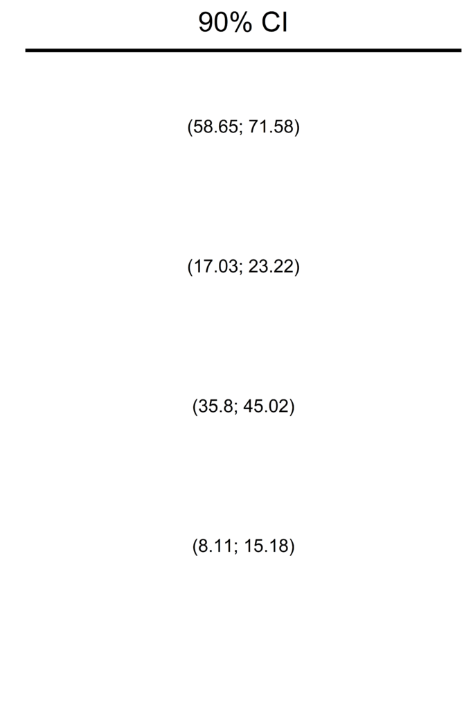
Similar to Table 1 above, the x-axis has been removed. The y-axis range is similar to that of the table and plots above. Everything should align properly in the final forest plot below.
Combine all Panels to Create a Single Figure
#Install and load the gridExtra package to put together the individual components
install.packages("gridExtra")
library(gridExtra)

#Put the individual components of the forest plot together
fplt <- grid.arrange(p1, p2, t1, t2, widths=c(4,4,1,2))