How to Create a Scatterplot in R
A scatterplot (also known as a correlation plot) is a graph used to visualize the relationship between two variables. When looking at a scatterplot, one is usually interested in the correlation between the two variables. In addition to the type of relationship, a scatterplot shows us if there is a strong or weak correlation, and if the correlation is positive or negative.
As illustrated below, the function geom_point() can be used in R to create a scatterplot.
The dataset
We used the trees data from r-base to create a scatterplot in r. The trees dataset contains measurements of the diameter, height and volume of timber, from 31 felled black cherry trees. Therefore the dataset contains 31 rows and 3 columns or variables: diameter (inches), height (feet), volume (cubic feet).
Creating the Scatterplot in R
The following r code create a scatterplot of diameter versus height. The name of the dataset (trees) and the aesthetics (aes…) should be specified, that is, diameter should be plotted on the x-axis and height on the y-axis.
ggplot(trees, aes(x=Diameter, y=Height)) +
  geom_point()
The above code produces a simple scatterplot as shown on the right. However you may want a higher quality graph for a presentation or a report. To do this, we need to add a few lines of codes.
We could also manually define the range of the x- and y-axes, and also change to color of the points from black (default) to blue.


#adding color and setting the axis range
ggplot(trees, aes(x=Diameter, y=Height)) +
  geom_point(colour = "blue", size = 2) +
  xlim(5, 25) +
  ylim(60, 100) +
  theme_classic()
The arguments for color and size of the points were specified in the function geom_point().
xlim() and ylim() were used to specify the ranges of the axes. theme_classic() is used to customize the background to give the graph a cleaner look.
Scatterplot with Different Shapes and Colors
The next examples illustrates how to plot different symbols and colors in the same scatterplot. In addition to the 2 variables in the x- and y-axes, a third variables in introduce to indicate the different categories.
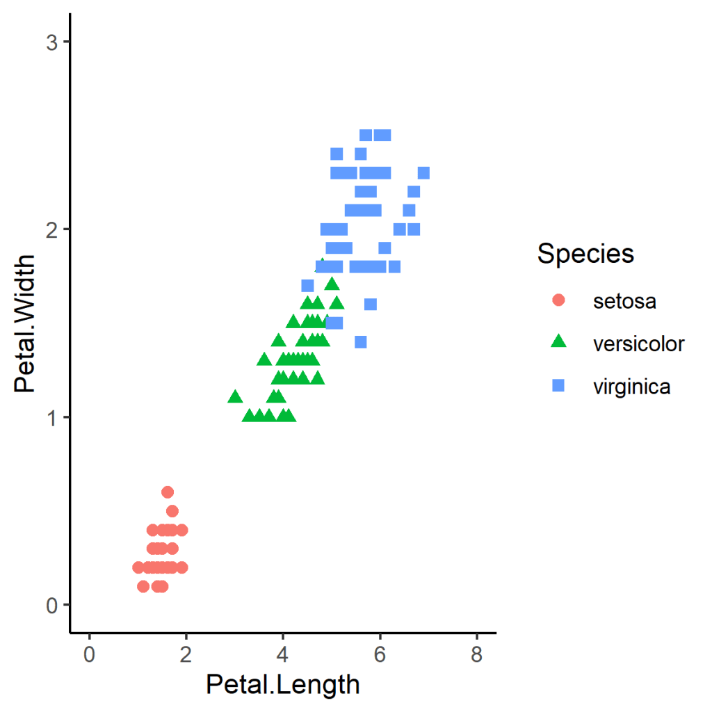
Consider the iris dataset which contains measurements of the length and width of the petals and sepals of 150 flowers from three different species of iris. For our example, we will create a scatterplot of petal width versus petal length, using different symbols (shape) for each species.
#using different symbols (shape) in the scatterplot (using shape = ...)
ggplot(iris, aes(x=Petal.Length, y=Petal.Width)) +
  geom_point(colour = "blue", size = 2, aes(shape = Species)) +
  xlim(0, 8) +
  ylim(0, 3) +
  theme_classic()
To plot the species in different colors and different symbols, the following should be specified: aes(shape = Species, colour = Species). The complete R code will then be as follows:
#using different symbols (shape) and colors in the scatterplot (using shape = ..., colour= ...)
ggplot(iris, aes(x=Petal.Length, y=Petal.Width)) +
  geom_point(size = 2, aes(shape = Species, colour = Species)) +
  xlim(0, 8) +
  ylim(0, 3) +
  theme_classic()