How to Create a Scatterplot Matrix in R
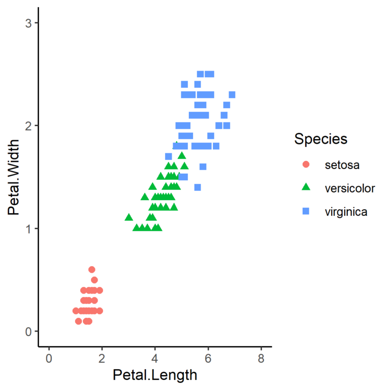
A scatterplot helps you visualize the relationship between two variables. When there are more than two variables and you would like to visualize the relationship between each variable with every other variable, rather than generating a separate graph for each pair of variables, a scatterplot matrix is a much better approach.
A scatterplot matrix presents multiple scatterplots (multiple panels) in a single graph. Each panel shows the scatterplot for a pair of variables. It is also very common to also display the correlation coefficient of each pair.
The GGally package, an extension of the Ggplot2 package is a very useful tool to generate a scatterplot matrix in R. GGally provides the function ggpairs(), which does all the heavy lifting and makes it very easy to create a scatterplot matrix.
Example in R
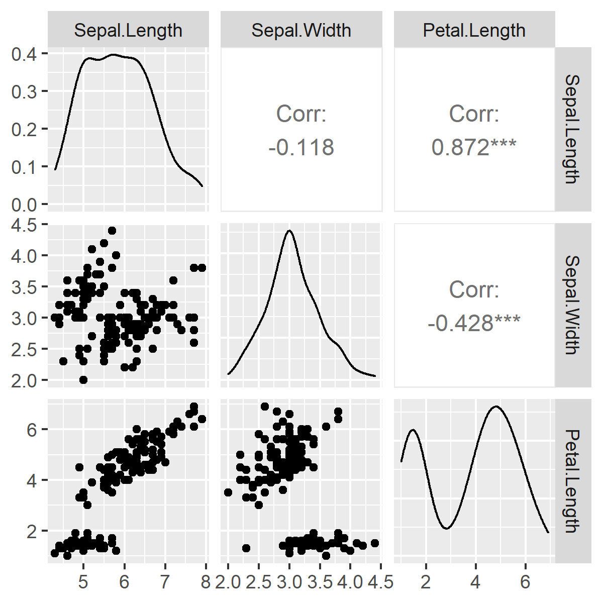
Here is a simple example of generating a scatterplot matrix in R using the GGally package. Let’s use the iris dataset to create a scatterplot matrix of the four variables: sepal length, sepal width, petal length, and petal width. All you have to do is specify the name of the dataset (iris) and the columns of the dataset that should be used (1:4 refers to columns 1 to 4).
#Scatterplot matrix of the first four variables of the dataframe
ggpairs(iris[,1:4])
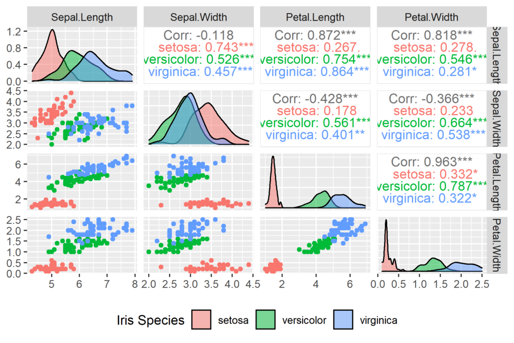
In this example, we get a scatterplot matrix with diagonal panels showing the density plot of each variable. One half of the scatterplot matrix shows the scatterplots for each pair of variables while the other half shows the corresponding Pearson correlation coefficient of each pair.
Separate Each Species
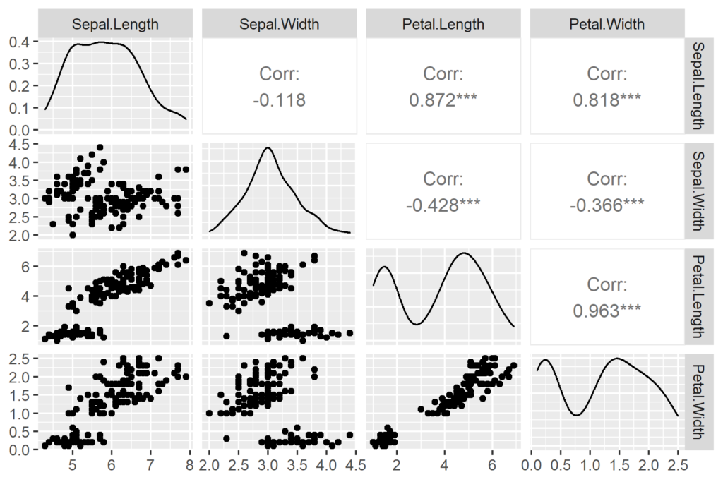
In the above example, data from all three species in the iris dataset are pooled and presented together as if from a single species. In practice, we would want to show the data from each species separately, or in a different color on the same plot. This can be achieved as follows:
ggpairs(iris, columns = c(1:4), aes(color = Species), legend = 1,
        diag = list(continuous = wrap("densityDiag", alpha=0.5 ))  ) +
  theme(legend.position = "bottom") +
  labs(fill = "Iris Species")
In this case, we include all the variables needed for the plot and also the Species variable. Then we use the columns parameter (columns = c(1:4)) to specify that only columns 1 to 4 should be shown as panels. To show each species in a different color, we use aes(color=Species). Legend = 1 means that the legend should be shown. To make the density plots transparent we use the specifications in diag = list(…). The theme(…) and lab(…) functions, just like in ggplot2, are used here to position the legend and add a label to the legend, respectively.